Introduction
As a course creator, you may be struggling with taking forever to design your new pages and screens for your business. In this lesson, we’re learning all about wireframes. You’ll learn how to use wireframes to design pages and learning apps so you can hone in on your key messages and features, lock in on your new designs, and create faster ones with fewer iterations.
In this article, we’ll explore wireframing – what it is, why use it, and how to use it. Then, we’ll go over a tutorial, and finally, we’ll summarize all our top tips.
Challenges online course creators can face if they don’t use wireframes to design web pages and learning:
- Without wireframes, online course creators risk creating courses with a disjointed and confusing structure.
- Lack of wireframing may lead to overlooked user experience issues, hindering effective learning.
- Without a visual guide, creators may struggle to organize content, resulting in overwhelming courses for learners.
- The absence of wireframes can lead to inefficient development processes, causing delays and rework.
- Creators may overlook essential learning objectives, impacting the overall educational value of the online course.
Video Lesson – How To Use Wireframing To Design Pages & Learning Apps
Who Can Use Wireframe?
Almost any teacher or professional can use wireframes to craft user-friendly and aesthetically pleasing digital experiences.
- To plan the layout and visual elements of their online courses, ensuring a cohesive and aesthetically pleasing virtual learning environment.
- To structure online course content, allowing them to seamlessly weave together instructional materials and create a visually engaging learning experience.
- To map out the flow and organization of online course content, ensuring a clear and structured narrative that enhances the learning journey for participants.
This can work for a wide range of professionals like interior designers, costume designers, and editors.
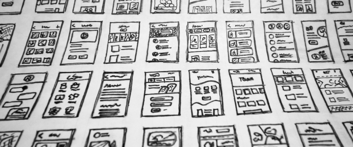
What Is It?
Wireframes are a low-fidelity blueprint of a screen design showing headings, images, sections, and buttons, almost like a coloring book.
It doesn’t have detailed words or the final image, but it does display precisely that there’s this heading. There are these two images. There are these three essential buttons. There’s this nav bar. You’re figuring out the high-level design.
It’s almost like a blueprint for a house, and you’re agreeing that these are the essential features that your house needs. Except in your case, you’re building a sales page for your course or the interface for your community.
Why Use It?
Maybe you’re thinking that you’re not a designer or you’re creative because you teach music, writing, and sewing. Nevertheless, wireframes are an important skill for you to know as a creative business owner. Whether you’re doing it or somebody else on your team is doing it, you need to be familiar with wireframes to use them to design your different interfaces.
By using wireframes, they’re going to allow you to quickly and cost-effectively help design the most essential customer experience elements. You’ll have crystal clear accuracy on what your homepage will look like.
You’ll know the critical things on your coaching page, your sales page, or your community help page and the most important things there. These are things like a search bar, buy button, etc. You don’t need to figure out the exact text.
At this point, you want to ensure there’s this big picture. There’s an overview. There’s that first buy button. Provide more information. There’s a second buy button, whatever you’re designing.
By either figuring out a wireframe as a business owner or working with an artist or a designer, their first step is to develop a wireframe. For this thing that you need, you review the wireframe. That’s the high-level plan. Figure that out before you fight with colors and which fonts and text, and change this before you even get into all those details.
You take it up a level and figure out the wireframe for whatever you’re trying to design. It’s just a couple of big boxes. You’re figuring it out. You’re looking at it. Maybe you’re exchanging back and forth with a PDF, providing some simple notes by saying you want the FAQs lower or you need another buy button on the bottom.
Whatever it is, you’re going back and forth. Very high level. You’re not figuring out the color of the buy button, the shape of the buy button, the shadow—forget about that stuff. You’re just figuring out the most essential thing is that you need a buy button, as an example.
Need Coaching? We Got You.
Level up your business with an experienced tech partner.

Check out our 1:1 personal pathfinder, small group leader Zooms, or quick technical audits.
Wireframes are going to be awesome. They’re going to help you go faster. You’re going to lock in on those high-level, most essential things that you need on all your screens. And once you have that ironed out, you’re just filling in, just like a coloring book. You’re going to fill it in.
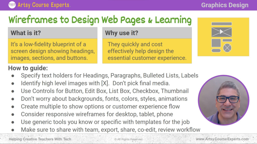
How-to Guide
Specify Text Holders
You will specify text holders for headings, paragraphs, bulleted lists, and even labels like your username and password. Those are texts you don’t have to figure out – the exact words, the capitals, etc.
Just know, on this part of the screen, there’s this giant big text. It’s the heading. It’s the introduction or, hey, here’s a little paragraph.
You don’t have to figure out the exact paragraph to copy. And by the way, remember, that could come from somebody else. It might be you as the business owner, or it might be a marketing or copywriter that you get to help you out. Figuring out the layout with the wireframe is essential.
The designer may not have the correct text, or they may copy text from somewhere else. You want to decouple these things. You’re going to have an extensive layout of what goes where.
Identify High-Level Images with [X]
In phase two, you fill in the text, the image, etc. The next thing is the media, the high-level images. Do you have a big image on the page? If you do, by the way, you’re just going to see a box, maybe with an X in it or perhaps a generic image. So that’s just letting you know that, hey, there’s this big image there, and you’re going to figure out the general shape.
Whether it is widescreen, square, tiny thumbnail-like, or whether there are four or five of these. It might be that there’s a video. You’re not going to choose the video. You might already know it, but that’s okay. At this point, you’re just figuring out that there’s a big image here.
There are these three little images. There’s this little logo thing on the top left. That’s what you want to figure out. You’re not going to figure out the details of which logo you’re going to use. You’re just going to say, “hey, I got a logo over here”. I got an image of here or a video area. There’s a big square with a play button.
That’s all you need for now. You’re just trying to figure out if you start in widescreen mode or if your video is in a tiny little box. Your students need to maximize it later. So you’re just trying to figure out where the different media and images are. Maybe you have an audio bar or a video. You’re just trying to lay them all out on your big or mobile screen.
Use Controls for Button, Edit Box, List Box, Checkbox, Thumbnail
These are the standard controls that you find on every operating system, whether you’re on a Mac, Windows, or mobile. Whatever they are, you won’t draw them exactly how they will look on the latest Apple iOS.
That doesn’t matter. The point is that you’re going to identify a button, or an edit box where you type your username, or here’s a list box, choose one or more of these items or click a button to do a drop-down, and then you’re going to choose an item. That’s all that matters. So, you will have these generic user controls laid out on your screen.
Others might include checkboxes or radio buttons. If this were a coaching blog, you would have thumbnails next to the title of your blog article and then kind of a snippet. You would have that pattern repeated. You’re not going to draw the actual thumbnail.
You’re not going to have three examples. If you want that, that’s the next step after wireframes. Once you figure out the blueprint, you can color it in and check it out.
Don’t Worry about Backgrounds, Fonts, Colors, Styles, Animations
This is a wireframe – It’s a bunch of boxes that’s letting you know what goes where. Don’t worry about a bigger font or a secondary font, not that first Google font or whatever, or the color.
It’s the secondary purple. That doesn’t matter. Just get all your content there.
You don’t care at this stage on the wireframe how thick your lines are or if there are shadows or animations. That’s not essential right now.
Create Multiple to Show Options or Customer Experience Flow
These are just different approaches to laying out these screens. You may also want to have different wireframes for each stage. For example, let’s say they’re buying your online course. So, the first wireframe that you should design is your sales page.Then, the next wireframe is your checkout page, which shows you have testimonials on the right. You have a guarantee here. You have a minimalistic credit card entry. There’s this other section that pops open with coupons and other things like that. Then, after that screen, this different wireframe shows the welcome. In that case, you create a wireframe for each customer journey stage.
Consider Responsive Wireframes for Desktop, Tablet, Phone
Next, you may want to use several wireframes to show what your particular screen looks like on different devices. This is called responsive web design, so you may want to have a design for the desktop – a huge, typical computer screen with a big window – or even a tablet that has slightly less space and is constrained, or even a mobile phone, thinking about what it looks like vertically or horizontally.
Depending on what you’re doing, you may want to have that. You may want to have just the essentials, like the desktop and the vertical mobile view, or you may want to go to that next stage. Depending on your platforms, some of this happens naturally, but you will like that high-level layout.
What’s at the top, what’s in the middle, what’s on the bottom, what’s on the sides, and figure out and have an idea of what your design will look like on all the different devices.
Use Generic Tools You Know or Specific with Templates for the Job
These are like Word document editors or slides, presentation views, and just put some boxes there. Generic tools could even be designed programs like Photoshop, Illustrator, Figma, etc. These are programs that can draw. You can manipulate the shape of squares to make them rounded and that button and all this sort of stuff. If you’re not a designer by trade, you’re creative, but you’re maybe a maker or working with a V or writing, etc.
If you don’t want to use generic tools, you can get devices that focus on creating wireframes. They have all the different stencils, all the different shapes of every single standard component.
Here’s an image, here’s a text box, here’s a button, here’s an edit control. And that makes it easy to drag and drop, create your layout, whether you’re doing it or collaborating with a designer and they’re doing it, or you’re just chiming in.
It’s almost as if you were sketching on a napkin high-level big stuff. Here’s the image. Here’s some text. Here’s this video area. Here’s the navigation bar where I choose the lesson. You’re just selecting those big things, but it’s just so much easier with a digital tool. So, if you’re super comfortable with existing tools that are generic, that’s cool.
Again, you’re just putting boxes and things like that around the screen, or you can go ahead and get a wireframing tool dedicated to this. And by the way, it could help you with other things too, like if you’re doing a site layout or an org chart or other stuff like that.
Finally, once you have those wireframes, share them with the team. Export them as a JPEG, PNG, or PDF, share them, and get feedback. Maybe you might even have a couple of special friendly customers you might want to share with by asking them what they think, if it looks complicated, or if anything is missing. After getting that feedback, collaborate with your partners. Whether you’re creating a design or they’re creating the layout, you can mark up; you can provide feedback verbally, and then review that workflow from beginning to end; beyond that one screen, think about the several screens that go along with different stages, different needs, or different flows that happen in your business.
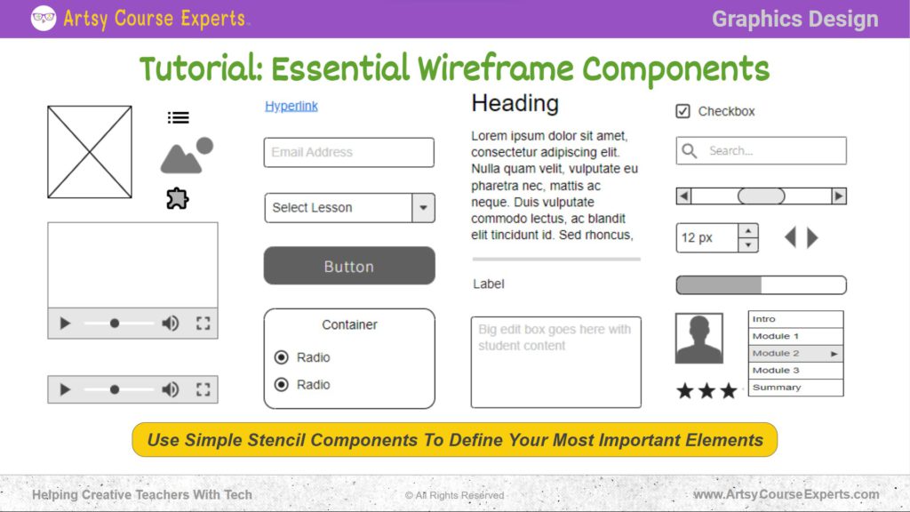
Tutorial: Essential Wireframe Components
Now, let’s check out a tutorial about the essential wireframing components. These are all the components you would typically find on a good wireframe.
Images
You might have different images. The images might be expressed with a box with an X in it, but you’re going to define: is it a little image like a thumbnail, or is it a wide banner at the top of the screen that’s a big long rectangle?
Nevertheless, you’re going to have these images identified. Where are they? Are they to the ends of the screen, or are they padded? If you have a logo or an icon, you don’t need the final image. You need to know that there’s a little image and a slight shape here. You’re going to go work that out, but you’re just trying to see the big blueprint for your page or your interface. It’s the same thing if you have video or audio; you’re just going to have a big box with a play button, and you try to understand if it is a big video that they have to maximize or if it is a medium video.
Maybe it’s a sizzle reel, or perhaps you’re in the course, and right away, it’s a huge video box, and they press play, or maybe it auto starts. You don’t have to get into that. You know that on that particular course page, lessons are on the left, and a big video box in the middle.
Hyperlinks
The same thing with hyperlinks; you don’t need to have the exact text you will have for the hyperlink. You may have some text with an underscore line; it might not even be blue. It might just be text with an underline, and you state that there’s a hyperlink there.
Boxes
It’s the same thing with boxes that have edit controls. You might put a little text of what it is like: “box with email.” You don’t have to get into the style of the box or the edit control or the font that’s there or the color of it.
Button
What should be on the screen, and the same for other things like drop-down list boxes or buttons? You’re just going to have a shape that looks like a button, and you can call it a button if you want. You could say “buy for now,” even though later you might change that “buy” to “start now, exclamation point.” That’s fine, but for now, on that initial wireframe, you have a button, and it’s just by, right, to get it going.
Containers
You might have containers; you might list out your different elements on your wireframe, or you could put them in sections or groups on your screen. In there, you could have radio buttons or text with a button or whatever.
Maybe you don’t have containers, and you have sections of your page – the left side, the middle, things like that, or top, middle, bottom – and that’s fine too. As you get further, you state that you need this little group of items over here on the right. That’s okay. You can have a little section, a little container, and at least remind you, okay, I have this little box over here with some stuff.
Headings
Now, when you have headings, you don’t have to figure out your perfect hook line. You’re just going to have either a bar, or you might have text that says heading, and that’s it. The same thing applies to paragraphs. You don’t have to write it. You could copy-paste some standard Lorem Ipsum Latin text, or you could have these squiggly lines that let you know, hey, [00:16:00] there are four or five rows of text there.
That will be a paragraph of stuff that I will write later. Sometimes, in wireframes, if you’re not using sections, you can stack items, or you can use horizontal bars again. You don’t have to worry about how thick the bar is, what color is gray or shading, or whether it’s rounded. You’ll have a line, just a nice little bar. That’s all you need. You’re figuring out your big architecture on your screen on your user experience.
Edit Boxes
The same thing with edit boxes is that you can have small edit boxes where people type one line or a big edit box where maybe they’re typing a review. Or they’re going to type some notes, and that’s fine. Just put a box there with a couple of squiggly lines or some generic text, and that’s it.
You know what goes there, and you’ll figure it out, but at least you know how wide it is, how big it is, if there is other stuff and if there is a tooltip that has some other text below it or on the side. That’s what you need to figure out in your wireframe.
Check Box
Depending on the wireframing tool, you might have additional controls like checkboxes, search bars, progress bars, spinners up and down, or even navigation – next page, prior page, and next page if your wireframing tool might have advanced versions of generic images. So, instead of just the box with the square, if you know you need a profile, there might be a profile picture. If not, that’s okay. You can simply use a box with an X, and you know that there’s a little image there.
It’s the same thing for other stuff like you might need ratings and reviews. Suppose you have a wireframing tool that has ratings and reviews; great. If not, put four little image boxes or one horizontal rectangle and type stars.
Menus
The same thing applies to menus; whether you’re doing a header at the top of your main menu, whether you’re designing a web page that has a massive main menu, or inside your community, you might have a sidebar that has all the rooms again.
Labels
When you have labels, you might have a word there. You could put “label,” or if you want to, you could just put some simple stuff like “name” and “password.”
You can put a bunch of text labels there. If your wireframing tool has a vertical menu, you can put that. So don’t worry about it. The point is to identify what are the significant items on your screen.
Frequently Asked Questions About Wireframes to Design Web Pages & Learning
Summary – Using Wireframes to Design Web Pages & Learning
Using wireframes to design web pages and learning is like creating a blueprint for a house. It helps you plan where everything should go without worrying about colors and fancy details. Whether you’re a designer or not, wireframes make it easy to sketch out your ideas, organize content, and ensure a smooth learning experience for your online courses.
Keep it simple, focus on the big picture, and enjoy the efficiency wireframes bring to your creative process.
Tips for creative online course creators when using wireframes to design web pages & learning:
- Clearly outline your wireframe components to map out essential elements such as images, headings, paragraphs, and labels.
- Utilize containers to organize and structure your wireframe, grouping related elements to enhance visual clarity.
- Prioritize simplicity in edit boxes, indicating the type of content without delving into detailed design elements.
- Use checkboxes, search bars, progress bars, and other controls to enhance user interactivity and experience.
- Incorporate generic images or symbols to represent complex visual elements before finalizing specific design details.
- Streamline menus for easy navigation, ensuring a user-friendly experience throughout your online course.
- Focus on the significant screen items and functionalities in your wireframe, avoiding unnecessary details to expedite the design process.
You should be a little smarter now. Thanks for hanging out!
Please subscribe to get more tips for creative online course teachers.
More Tips For Online Teachers
These lessons can also help you with Marketing, Sales, and Technology:
- Using Negative Keywords to Optimize Ads
- Hex Color Codes for Instructors & Coaches
- Domains Vs. Hosting For Teachers And Coaches
- Plan Teacher Website With Coach
- Minimum Viable Products for Teachers