Introduction
In today’s digital age, online courses have become increasingly popular, offering flexible and accessible learning opportunities for students worldwide. To ensure an easy learning experience, it is best to prioritize responsive web design.
In this lesson, we’ll explore responsive web design, enabling you to build products and services that function seamlessly on any device. We’ll discuss what responsive web design entails and its importance, as well as the potential challenges that arise when it is not implemented.
Furthermore, we’ll look into the specifics of creating and testing responsive web design screens effectively. To illustrate these concepts, we’ll conclude with a practical example.
Challenges online course creators can face if they don’t use responsive web design:
- Users may become frustrated when they encounter content displayed in incorrect fonts, leading to a subpar learning experience.
- The sizing of elements can cause issues, with some appearing disproportionately large while others may become minuscule.
- It can hinder efficient scrolling and disrupt the flow of consuming course material or engaging in community discussions.
- Online courses may not be easily accessible to individuals with disabilities or those using assistive technologies.
- Non mobile-friendly websites may suffer from lower search engine rankings.
Video Lesson – How to Design based on Screen Size, Platform and Orientation
Who Can Use It?
Almost any kind of teacher, professional, or coach can use Responsive Web Design to improve accessibility of content, enhance easy user-experience, and ensure usability across their various platforms.
Here are some examples of how teachers helping creative students can use Responsive Web Design:
- Enhance the usability and navigation of their online course platforms.
- Create mobile-friendly layouts that adapt to various screen sizes.
- Build intuitive and user-friendly interfaces across multiple devices.
This can work for a wide range of educational businesses like teaching video editing, audio editing, blogging and designing.
What Is It?
Responsive web design enables web pages to appear stunning across different screen sizes and orientations, including large monitors, tablets, and mobile phones. It is a crucial element in ensuring online course content seamlessly adjusts to various devices and screen sizes, whether in vertical or horizontal orientation.
Tablets, for instance, can detect their orientation and instruct the browser or apps to display content optimally. This intelligent adaptation considers the device’s size and orientation to deliver an enhanced user experience.
Why Use It?
You would use responsive web design to provide the best experience across all devices, including desktops, tablets, and phones. It is crucial not to simply squeeze the desktop layout onto a phone, as everything would appear tiny. For example, on a phone, you may opt for a full-screen layout with two columns.
On a phone, the page becomes longer, but each section remains readable. Users can scroll down to view additional columns like sidebars or navigation bars. It is essential not to take the phone design and directly apply it to a desktop or vice versa, as it would lead to an impractical and visually unappealing result.
Responsive web design techniques intelligently adapt to the device and its orientation, dynamically displaying content, chunks, columns, rows, and images. For instance, menus can either remain on the sidebar at all times or be hidden until triggered by a tap on the mini menu, often referred to as the hamburger menu.
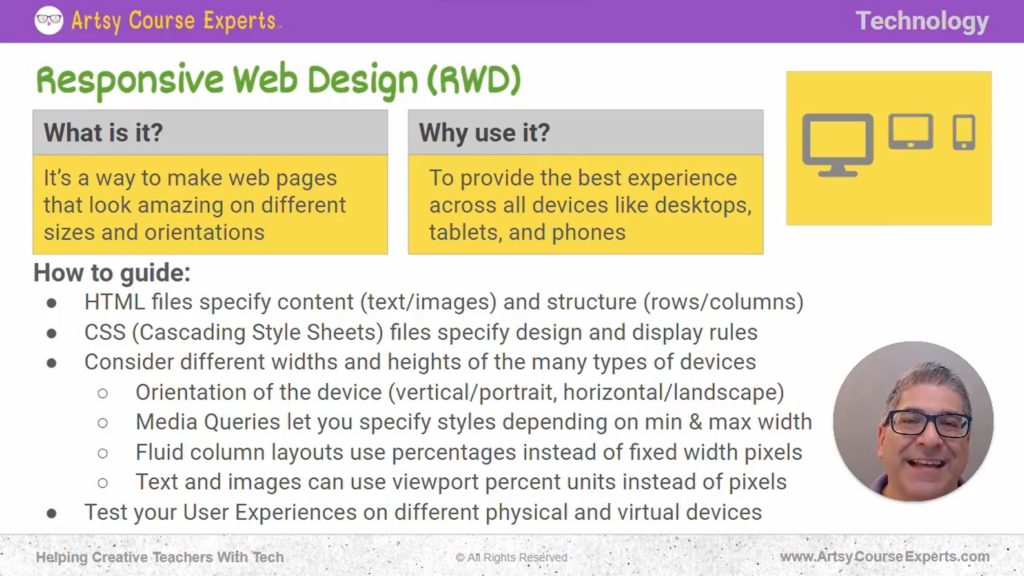
How To Guide For Responsive Web Design
Now, let’s delve into the basics of responsive web design. Even if you’re not building it yourself and are relying on a tech team or using third-party tools like Thinkific, Kajabi, Teachable, Padia, Mighty Networks, etc., it’s important to understand and describe these requirements.
By comparing systems on different devices, you can ensure the best possible experience for your students and members.
HTML Files Specify Content and Structure
To achieve responsive web design, we’re discussing webpages, whether accessed through a browser or an app, which is essentially a web-based application.
These webpages are constructed using HTML, which encompasses the content, including text, images, and videos, as well as the foundational structure. For instance, it determines whether the page features one or two columns, the number of rows, and the presence of a header, body, and footer.
HTML describes these fundamental elements: columns, rows, assets (such as images and videos), and text.
CSS Files Specify Design and Display Rules
Then HTML is enhanced with Cascading Style Sheets (CSS) files. These files define the design and display rules. For instance, CSS describes borders, colors, and font sizes, which are fundamental attributes for each section.
CSS can be applied to the entire page or specific sections on the screen. It allows you to control when certain elements should be displayed. For example, using CSS, you can hide or show specific blocks on different devices.
You can create a special layout with a mobile-friendly design for mobile phones and hide it on desktops, or vice versa. CSS provides rules for visual appearance and determines when to hide or show elements.
Consider Different Dimensions
The core aspect of responsive web design revolves around the different widths and heights of devices. It’s important to note that we’re referring to the visible viewport and not the content below the scroll.
We need to determine the width and height of the content at any given point, and CSS assists us in this regard, along with considering the width and height values provided by the devices themselves.
Orientation of the Device
When holding a tablet vertically, the width is narrower but the height is longer. On the other hand, in landscape format, the width is wider, but the height is shorter. Tablets and mobile phones can communicate their orientation to the browser, whereas desktop monitors may not provide this information automatically.
Therefore, when designing responsively, we consider both width and height, as well as the device’s orientation. Combining these factors results in the viewport, which represents the visible width and height of content for your online course, community, teacher website, webinars, and more.
Media Queries Let You Specify Styles
There’s a concept called a media query, which allows you to define custom styles based on width and height. A media query can be configured to apply specific styles if the width is below a certain value, or if the viewport width is larger than a certain size, it can display a different layout, content, design, and style. For example, it can show two columns or switch to a single-column layout.
Fluid Column Layouts Use Percentages
Fluid column layouts utilize percentages instead of fixed-width pixels. With responsive web design, you no longer specify fixed pixel widths for columns. Instead, you use percentages. For instance, you can set the left column to occupy 30% of the screen width, and the right column to occupy 70% of the screen width. This approach ensures that your screens and pages look great on various devices.
Text and Images Usage
Text and images can also utilize viewport percent units instead of pixels. Rather than specifying a specific pixel width for images, you can set them to be a percentage of their parent container.
For example, if the parent container takes up half the screen, you can make the image fill 80% of that container. This allows text, fonts, and images to scale beautifully within their containers.
Instead of using a fixed pixel size for fonts, you can utilize percentage-based units that ensure proportional scaling. This ensures that your fonts look great on both mobile phones and large desktop screens.
Test Your User Experiences
Finally, once you have a system, whether you built it yourself or are using a responsive platform, that looks great across different device formats and orientations, you’re going to want to test it.
Test it on actual physical devices like your computer browser, tablet, kids’ tablet, or phone, or even borrow your wife’s phone. Visit stores like Target, BestBuy, Staples, etc., to see how your sales page or website appears on different devices.
Additionally, be aware that your computer browser has features to simulate different devices. You can use Chrome, Firefox, Edge, etc., to simulate being on a mobile phone or tablet.
These browsers often provide a dropdown menu with various device options, allowing you to preview how your content may appear on different devices, even if you only have an Android and want to see how it looks on an iPhone. These tools are part of responsive web design.
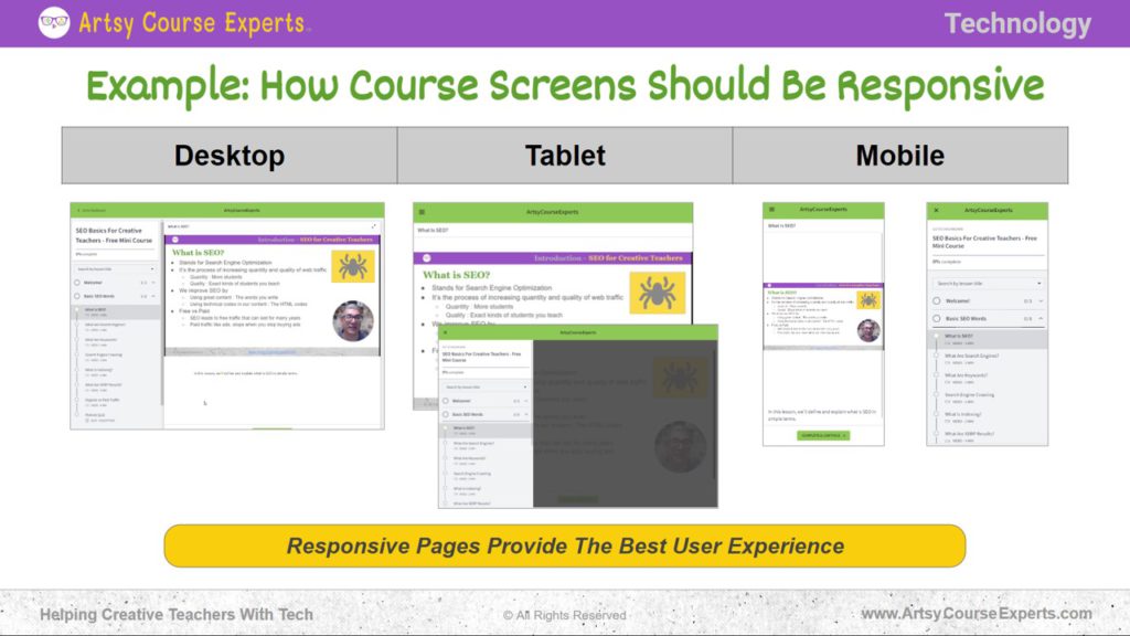
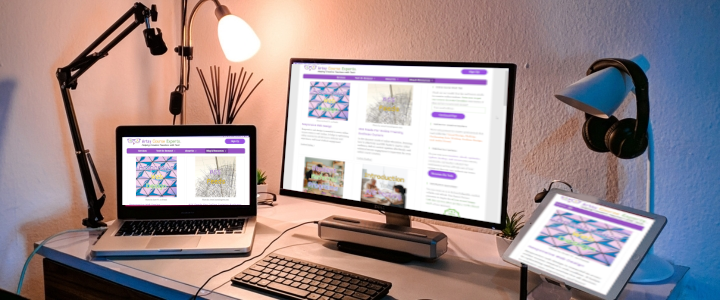
Example: How Course Screens Should Be Responsive
In this example, we will discuss how a course appears when designed with responsive capabilities.
Desktop
When viewing a course on a desktop, you will have a sidebar that allows you to easily navigate between different sections and lessons. The sidebar remains visible at all times.
You can use scroll bars on both the left and right sides of the screen to view your content, which may include slides or videos. A play button is available for videos, and you can access your profile or jump to various sections. In addition to slides and videos, you may also find text, paragraphs, or resources displayed below the main content.
The desktop view provides an open and immersive experience, allowing you to access all the important course materials while having a sidebar with a scroll bar.
Tablet
Next up is a slightly smaller device than a desktop, which is a tablet. On a tablet, the goal is to consume content. For instance, when you’re in a lesson, you would want the tablet to go into full-screen mode and display the entire video. If needed, you can press a button, such as the menu button, to show a navigation bar.
However, since you’re holding the tablet, the focus is primarily on consuming the video or lesson. When necessary, you can press buttons to navigate back to your courses or access the lesson structure and navigation bar. You can also dismiss pop-ups to concentrate on the specific content you need.
Mobile
Mobile devices have the smallest screen size. Users may hold their phones vertically or horizontally. Due to the limited screen space, mobile designs often use the hamburger menu, which is the three-bar icon that reveals a menu when clicked. This menu is utilized to hide content or display pop-ups only when necessary.
The goal is to prioritize the main content and minimize distractions. When held horizontally, the mobile design adapts to provide a wider rectangular view, making use of the available landscape space. This allows the content, especially videos in a 16:9 aspect ratio, to occupy the entire screen.
In summary, desktop designs offer various options simultaneously, tablet designs focus on one feature at a time, and mobile designs prioritize content in a stacked format with the option for pop-ups or additional content below the main content, depending on the screen size.
Frequently Asked Questions About Responsive Web Design
Summary – Responsive Web Design
Responsive web pages ensure the best user experience. This knowledge will also help you collaborate with technical experts to define your requirements and ensure your services work seamlessly across various customer experiences.
It is an essential aspect of creating an optimal learning experience for online course creators. Responsive web design empowers course creators to deliver their content effectively and provide a consistent and enjoyable learning experience for their students.
Tips for creative online course creators when using responsive web design:
- Remember to consider the size and orientation of your device.
- Test your products and services on different devices to understand their performance.
- During testing and evaluation, pay attention to font and image scaling to ensure appropriate display.
- Verify that scrolling functions properly and take note of how content may be rearranged on all screen types.
- Use appropriate image sizes and formats that load quickly without compromising quality.
You should be a little smarter now. Thanks for hanging out!
Please subscribe to get more tips for creative online course teachers.
More Tips For Online Teachers
These lessons can also help you with Operations and Technology:


